
REBRANDING:
FIRST METHODIST HOUSTON (PART I)
First Methodist Houston is Houston’s oldest church, and first moved into their current building downtown in 1890. It’s a building chock-full of history, from several one-of-a-kind stained glass pieces, to a century-old prayer rail rescued from fire, to the oldest operating elevator in the city. It’s a church that’s proud of who it is and who it’s been.

The Current Design
The problem was, when I arrived as a video editor in 2017, the graphic design for the church did not match the church’s aesthetic. The church’s logo looked like this:

And the artwork surrounding it matched it, unfortunately. I’m very sensitive to how difficult graphic design can be for understaffed churches who are doing the best they can, but this was a church that had two full-time graphic designers working for it, and this content was being created in 2016.


A Chance To Start Again
When I became communications director in 2018, I had the chance to reinvent the some of what the church was doing. But I was limited in the scope I was allowed. The church had plastered the existing logo all over both of their campuses, and there wasn’t the money or desire to do any rebranding. Our task became one of making the existing design feel cleaner and more modern without upsetting the apple cart.
What’s more, I was working with the same design team that had created the original looks. So it was also a matter of winning the team over to the idea that a refresh was a good idea.

So, we simplified the design we had and made it much more flexible. Suddenly, we could put it onto anything.
We followed that up with moving all of our design work to sleeker, more modern designs, paired with work that showed personality and life. And even as budget cuts led to working with smaller staffs and bigger workloads, that mentality has carried forward.


REBRANDING:
FIRST METHODIST HOUSTON (PART II)
Despite a strong contingent of voices insisting on the church branding remaining the same, our team was finally given the go-ahead to create some new potential branding for the church.
Since we figured that we would only get one shot at this and our window of time was pretty small, we worked to put together a presentation with a variety of pitches, hoping that being able to see the varieties that were possible, enthusiasm for the idea from church leadership would surge.
Pitch 1: Cleaning Things Up
We made sure our first design was something simple, clean, and above all, flexible. Something where we didn’t just love the design, but were able to show how the design would work in all different facets across both campuses.


Pitch 2: Traditional Design, Unconventional Formatting
We wanted our next pitch to feel significantly different from the first pitch, so that the series didn’t just feel like shades of the same concept.
For this one, we focused on our bell tower, and the symbol it is within the city.


Pitch 3: Simple, Modern, and Clean
After heavily leaning on the iconography of the church, we wanted a pitch that felt the complete opposite - something that felt much fresher, that could stand on its own as a symbol, that could live on a tee shirt or a sign or a sticker, something that could be ubiquitous without ever wearing out its welcome.


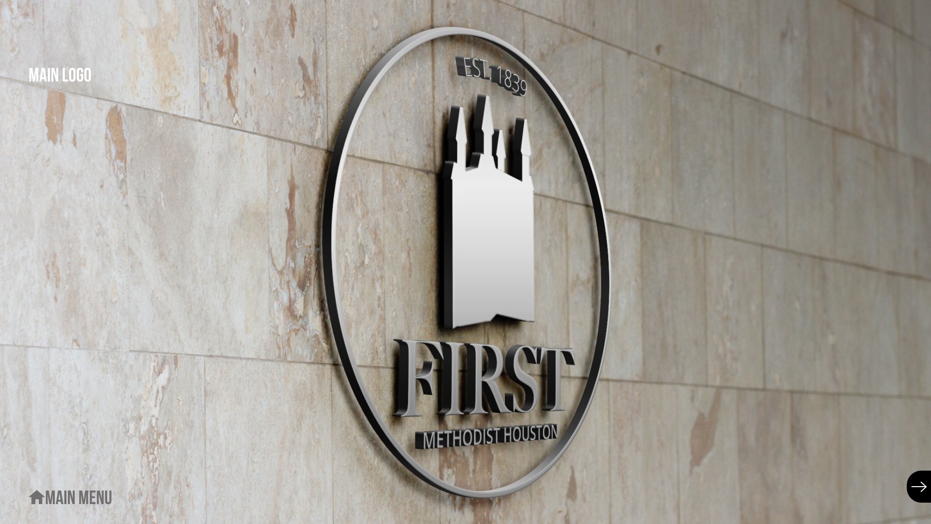
Pitch 4: The Church As Symbol
Once again, we zagged away from the previous pitch to go back to something much more traditional. This time, we really centered the bell tower as a traditional symbol - but encased in a circle, like a stamp, a blend of old design and new trends.


Pitch 5: The Stained Glass
The center of First Methodist Houston’s identity as a worshiping community is their historic downtown chapel, featuring giant pieces of stained glass art, many of them entirely unique to the church.

So we designed a logo around that identity:


REBRANDING:
FIRST METHODIST HOUSTON (PART III)
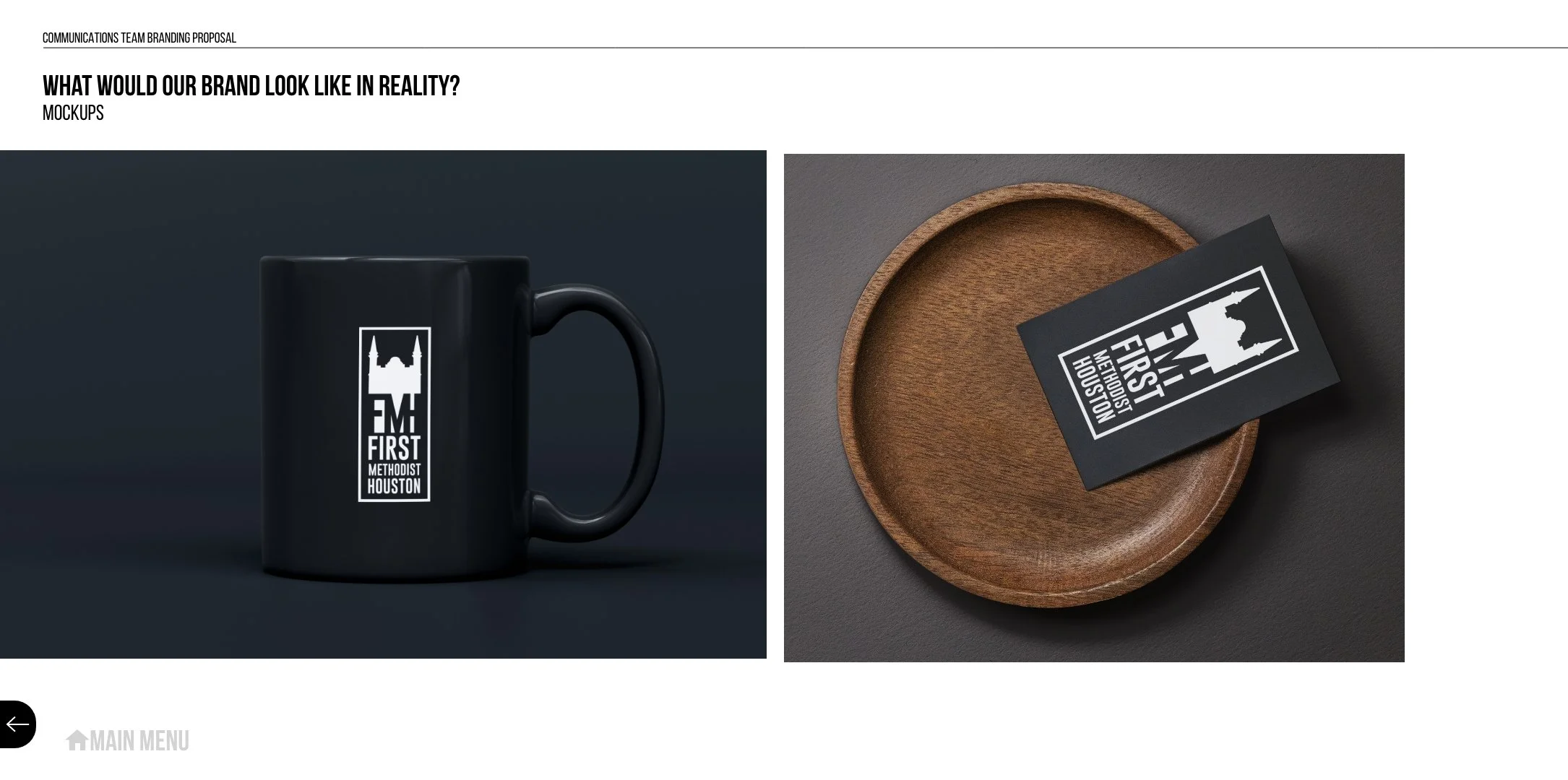
There was a sudden ask for a series of promotional items to hand out at church events, and because the pastor was inexperienced, she went straight to the designer rather than through the system. I got involved a few days later when the designer and the pastor had gotten into a sharp argument about the results - she had asked for something designed off the church logo, so the designer had used the church logo:

The problem was, once the pastor saw the results, they decided they wanted the designer to create a different logo for our church that was better (she sent over several churches with logos she liked better that we could use).
I explained that, no matter how important this project was, I could not actually change the logo of the church for her. But, that didn’t mean that we couldn’t create new promotional items for her that she’d like much better.
So, we went back to the drawing board. I put together a vision board of modern sticker concepts that I wanted to steer the designs more towards, then we broke down what we would want a sticker promoting the church to be. We came up with three key concepts:
We wanted something that would not just promote First Methodist Houston, but would represent the church and what it stood for.
We wanted something that our church members would really respond to and want to put up on their cars and computers, so that people would see the stickers everywhere.
We wanted something exciting enough that kids and students would put them on their water bottles.
We knew we weren’t going to get all of those all at once, but there was a real chance that we could create a set of stickers that would carry those values out to church members and church visitors. The key was not thinking of this as one perfect item, but as a set of products that would together succeed in our goal.
Design 1: The Bell Tower

Nothing symbolizes our church more than our historic bell tower, built in 1890. Working from a number of photos, we carefully traced the shape and created a visual representation of the building.
The motto “You Can Hear Us In The Streets” came from a Google review of the church I had always loved:
“We get it, you love Jesus. Now stop playing your bells 3 times a day.”
From that, I coined the tagline “You can hear us in the streets,” which church leadership immediately latched onto. A week later, we had renamed our church podcast the same thing.
This design was extremely popular, and we ended up using it for a host of other things related to hospitality. Seeing the bell tower design became a shorthand for find a hospitality station.

Design 2: The Glow-In-The-Dark Light Bulb

I wrote dozens of expressions and potential catchphrases for our designers to work around. One of them sparked an idea for a glow-in-the-dark sticker of a light bulb, based off the idea of being the light to the world.
It was a massive success among the kids and youth in our church. We couldn’t keep them around - we would hide the extras in drawers, and kids would find them and take a bunch of extras. We had to order more just to keep some in the hospitality stations.
Design 3: Following Jesus

The “Following Jesus” design come from a brainstorming session, where we tried to come up with a concept based around our motto: “following Jesus and inviting everybody to come along.” A design that made the first part into a laptop sticker was reformatted to be a smaller sticker, which ended up being the most universal of all of our stickers. People stuck these everywhere.
When Easter rolled around, we hosted a huge Easter egg hunt and created special Easter baskets for the kids, with the “Following Jesus” sticker converted into three different Easter formats.

In three months, we’d completely run out of stickers on both campuses and ordered hundreds more. It was the most successful hospitality campaign we ever ran.